DESIGN Playground: UI Explorations
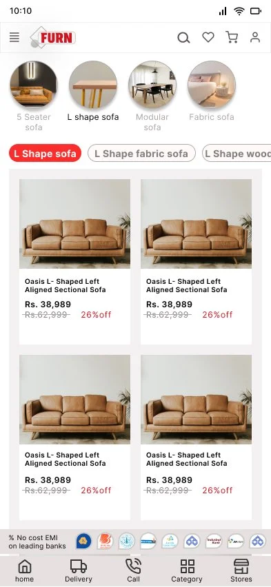
Furniture shopping app
Problem
Most furniture e-commerce apps feel cluttered, making it difficult for users to explore product options, compare prices, or get a clear sense of design aesthetics before purchase.

A curated set of UI explorations made in Figma — These Design layouts reflect my process of practicing visual design, and sharpening my craft outside of full case studies.
Solution
Designed Sleek-Furn, a furniture shopping app in Figma, with a focus on clean layouts, intuitive navigation, and product-first design. The app showcases furniture through large visuals, easy filtering, and quick access to details such as size, material, and EMI options.


Key Features / Highlights Minimal splash & onboarding screens for quick entry / Category-based navigation with intuitive icons / Clear product cards with price, discounts, & stock info / Simplified product detail page with CTA focus (Buy / Add to Wishlist)

2. Feet-Soul: Footwear App for Gen Z
Problem
Existing footwear platforms are either premium and not pocket-friendly for Gen Z or part of generic e-commerce apps where footwear is just another category. This creates a gap for a focused, affordable, and trend-driven footwear experience.
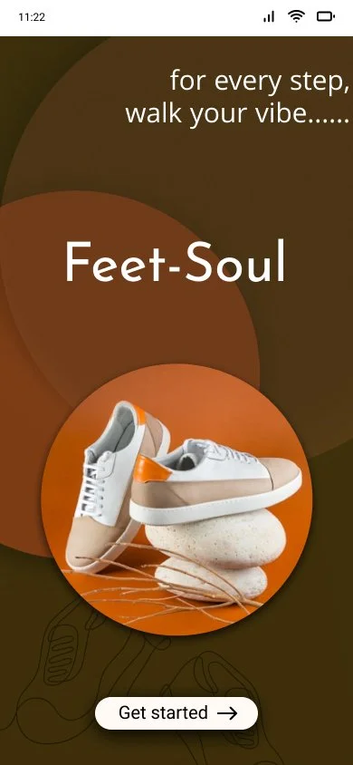
Solution
Feet-Soul is a footwear shopping app designed in Figma for Gen Z. It emphasizes bold visuals, affordability, and quick navigation, creating a shopping flow that feels both stylish and accessible.

Key Features / Highlights: Splash screen with youth-centric tagline / Easy category navigation (sneakers, sports, boots, casuals, etc.) / Trend-focused product detail pages with size selection, pricing, and CTAs (Add to Cart / Buy Now) / Gamified offers and discount banners to attract young buyers / Pocket-friendly, footwear-only experience tailored for Gen Z

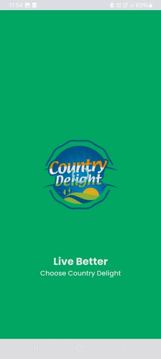
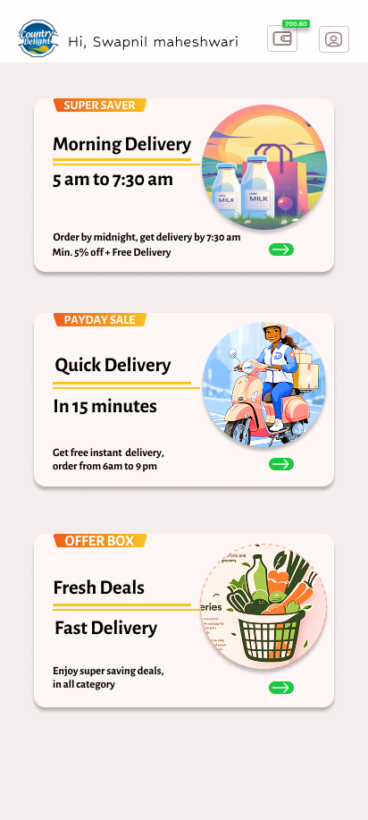
3. Country Delight App Redesign
Problem
The original offer page looked plain and text-heavy, with little visual appeal. It lacked balance between information and graphics, making the offers feel less engaging.
Before
Solution
I redesigned the offer & delivery page in Figma to be more vibrant, structured, and brand-consistent. Each offer was highlighted with bold headings, icons/illustrations, and clear call-to-action buttons, making it easier for users to scan and act.
After

Key Highlights
Categorized offers (Super Saver, Payday Sale, Offer Box) with visual distinction
Icons & illustrations that make delivery/offer options more relatable
Improved hierarchy → time, discount, and CTA stand out clearly
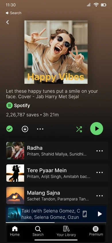
4. Spotify UI Detailing Study
Objective
To practice and refine my UI detailing skills, I recreated selected screens from the Spotify mobile app in Figma. The goal was not redesign but to analyze spacing, typography, iconography, and layout balance in a professional-grade product.
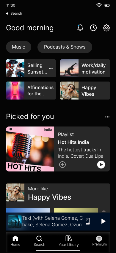
Learnings: Improved eye for alignment, margins, and consistency / Understanding of hierarchy between text, imagery, and CTAs / Better appreciation for subtle UI patterns in music apps.